
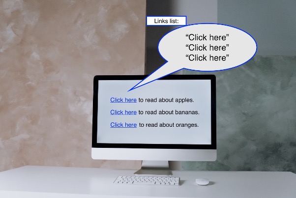
By Amy Chen. Picture this—you’re reading through a website trying to find a link to a resource that you urgently need, but all the hyperlinks that you encounter say “Click here” or “Read more.” You don’t know what the links are about.
This is a real dilemma faced by users who have visual impairments and use screen reader software that reads information from a computer or mobile device screen out loud. Screen reader users can choose an option to hear a list of all the links on the page to quickly find what they need.
However, uninformative link text will be read by itself, without the context of the additional words in the sentence. A screen reader might read out loud a list of links that says, “Click here, Click here, Click here,” or “Read more, Read more, Read more,” rather than “Read more about accessibility,” for example.
For this reason, it is important to write descriptive text for links in websites and documents for the benefit of all users.
Descriptive link text should give information about the link’s destination. If link text is generic and non-descriptive, like “Click here” or “Read more,” people may open the wrong link, or need to go back to read the paragraphs surrounding each link to try to find out where the link will go.
Descriptive link text actually helps all users get to link destinations and information faster. Non-descriptive link text is a usability issue, which turns into an accessibility issue for people who may not be able to quickly glance at the text surrounding the links.
The best practice is to use link text that describes the link’s destination, such as the webpage title or document title. Determining descriptive link text should not be difficult or require too much debate. Using the webpage or document title for link text also helps shorten sentences by removing extraneous words such as “click” and “here.”
For example, instead of:
- “Click here to visit Electronic Accessibility,” try “Visit Electronic Accessibility
- “Click here to review the 2021 UC Accountability Report,” try “Review the 2021 UC Accountability Report”
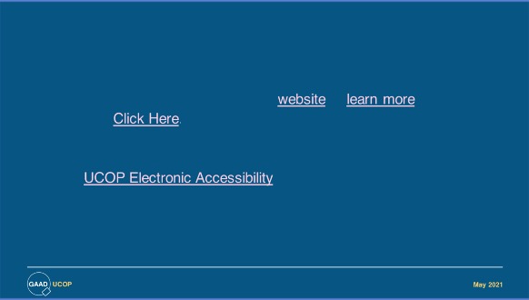
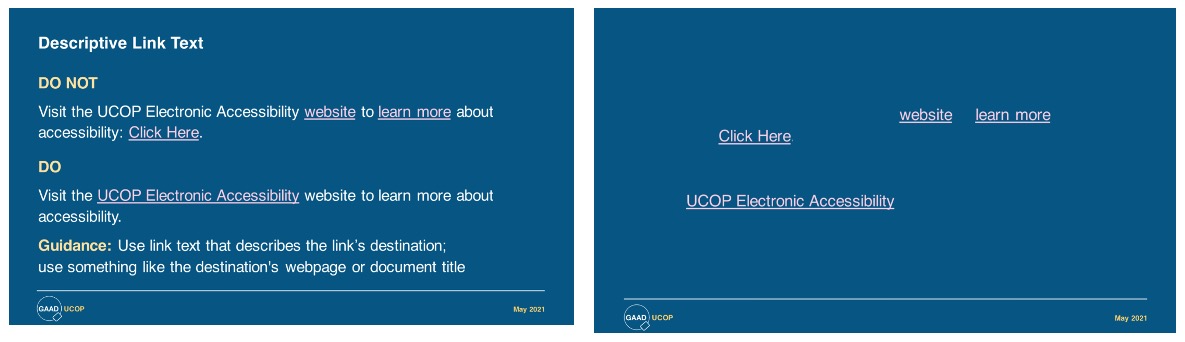
Here are some slides on link text examples from the presentation “Simple Steps for Improving Accessibility” in the Accessibility Is for Everyone webinar. The image titled Descriptive Link Text shows a variety of bad and good links. In the second image, the surrounding text content is removed leaving only the link text. This demonstrates how meaningless nondescriptive link text is for screen reader users.
A technical solution for the “Read More” links on the UC IT Blog
Some of you may be wondering about the “Read More” links on the homepage of the UC IT Blog! The nature of this particular blog platform prevents descriptive link text for each article. So a technical solution was designed. If you look at the link’s underlying code, the link has additional text such as, “Read More about SiteFarm: A UC Collaboration for Drupal Web Publishing.” The additional information was programmatically added to the “Read More” link for each article so that screen readers can distinguish the purpose of each link alone, which satisfies accessibility requirements.
The main point is to find a way to make sure that link text is descriptive and useful.
For more information on link text and other accessibility insights, explore:
- What’s wrong with using “Click Here” links? by Lucy Greco, web accessibility evangelist, UC Berkeley
- Accessibility Is for Everyone — UC’s 2021 Global Accessibility Awareness Day webinar, which includes a discussion of link text starting at 24:02-26:31 in the recording
- Links and Hypertext from WebAIM.org
- Electronic Accessibility at UCOP
Thank you to Douglas Harriman (UCOP), Jill Wolters (UCSF), Ken Lumnaokrut (UCOP), Todd McGill (UCI), and Yvonne Tevis (UCOP) for help and input on this article.

Thank you for this important post. Your screenshots and examples are very helpful. Even after all these years of accessibility outreach at OP, I continue to be surprised and dismayed by how often I still see the “click here” hyperlink. Your excellent post should get published at least once a year as a reminder.