

By Rita Rosenthal. According to We Rate COVID Dashboards, the work of a multi-university assessment team that rates COVID dashboards developed by colleges and universities nationwide, UC Berkeley has achieved an A+ rating. This grade puts us in the top 10 rated dashboards across the nation as well as the highest rated California university. The Dashboards that have been built to date include:
- COVID-19 Testing (see Figure 1)
- Contact Tracing
- Isolation and Quarantine
- Potential Workplace Exposure (see Figure 2)
- Immunization
- Wastewater Testing
The dashboards are available from Berkeley’s Coronavirus website, the hub for all COVID-related information since the onset of the pandemic. Dr. Guy Nicolette, Assistant Vice Chancellor of University Health Services (UHS) hails the dashboards as a useful tool that have had the flexibility to expand as the campus need has dictated. “What started as a necessary set of data to make medical and testing operational decisions became an incredibly useful set of windows into many aspects of our campus response to COVID-19. I am so appreciative of how UHS and the IST Enterprise Data and Analytics teams came together to build something that anyone could view at any time to get a clear picture of the situation!” Dr. Anna Harte, UHS Medical Director echoed those sentiments, “I’ve been using the dashboards on a daily basis to help inform public health decisions and recommendations for the campus. They provide the data I need to have at my fingertips in real time.”
Dashboard Benefits
- Informed decision making for campus health leaders and executives.
- Transparency of information for the larger community.
- Consistent definitions and information across dashboard content.
- Campus community focused on the work of mitigating COVID risks; and IT focused on the data.
- New partnerships for future post-COVID collaborations!
One IT in Action
“Getting the COVID dashboards in place has truly been a cross-campus IT effort from inception through launch. The need for this type of data to be readily available to help leaders on campus make more informed decisions was identified early on in our IT recovery committee work and was spun up fairly quickly with collaboration by multiple teams.” says CIO Jenn Stringer. Ideation, implementation, and support for the COVID Dashboards has been a great example of our One IT community in action, bringing together the following departmental partners and teams who have sponsored and drove this important work:
- University Health Services
- Environment, Health & Safety
- Berkeley Water Center
- Public Health
- Recovery Operations Team
- COVID IT Recovery Committee
- Facilities IT
- Campus Building Coordinators
Danny Grieb, Director of IST Enterprise Data and Analytics is proud of the work that has been done to date, adding, “Many thanks and kudos to my team for this important data and dashboard work that is helping to inform the return to campus for fall 2021.”
Take the Dashboards for a Spin
Explore the data at https://coronavirus.berkeley.edu/dashboard. Send questions regarding the dashboards to Danny Grieb at daniel.grieb@berkeley.edu.
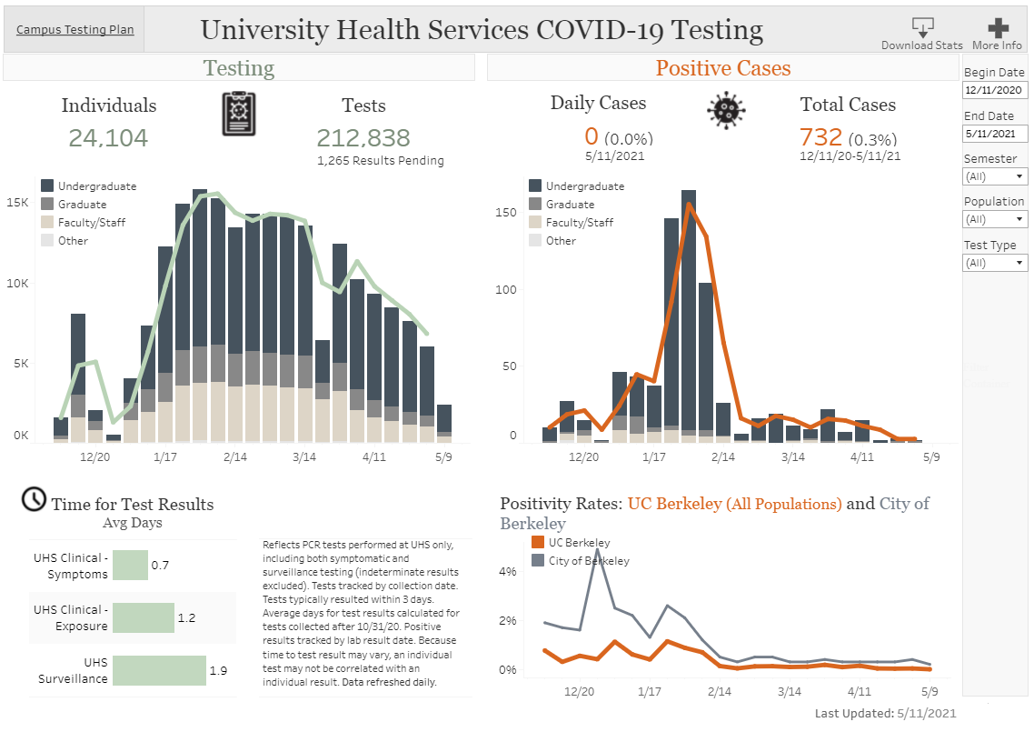
Figure 1: COVID-19 Testing Dashboard (click to enlarge)

Figure 2: Potential Workplace Exposure Dashboard (click to enlarge)
 Rita Rosenthal is communications manager, Office of the CIO, UC Berkeley.